
Imagine someone looking for a therapist. They grab their phone, search online, and find your website. But if the text is too small, the buttons do not work, or the pages take forever to load, they will leave—fast.
A responsive website changes its layout to fit any screen—phone, tablet, or computer. This means easy reading, smooth navigation, and a great user experience. For therapists, this is key. A well-designed website makes visitors feel comfortable, supported, and ready to reach out.
If your website is not mobile-friendly, you might be losing clients before they even read about your services. A responsive design helps you connect with the people who need you most. In this blog, let’s discuss further the importance of responsive web design and why it plays such an important role for therapists.
What is Responsive Web Design?
Responsive web design is a design approach that makes websites able to adapt dynamically to different screen sizes. The site still appears good and functions great whether the user is on a laptop, smartphone, or tablet. The idea is to provide a robust, seamless experience regardless of how someone is consuming it.
Responsive design uses smart coding and one version of a site to adapt to all screen sizes rather than designing multiple versions of a site for multiple devices. For instance, if a page consists of both images and text, those items will shrink, stretch, or stack depending on the device being used.
Essential Features of Responsive Web Design
Here are some important elements that make a website responsive-
- Flexible Grids- Grid layouts resize smoothly without breaking the design.
- Fluid Images- Images resize according to the screen size without any stretching or pixelating.
- Media queries- These are design rules that change how the site looks depending on the device size.
These features make responsive websites adaptable and easy to read for all users.
How Responsive Design Improves User Experience
- A responsive website reduces load times. Visitors do not have to wait for slow or oversized pages to load.
- It lowers bounce rates because users are less likely to leave the site due to poor usability.
- Navigation becomes simple, which ensures potential clients can find what they need without struggling.
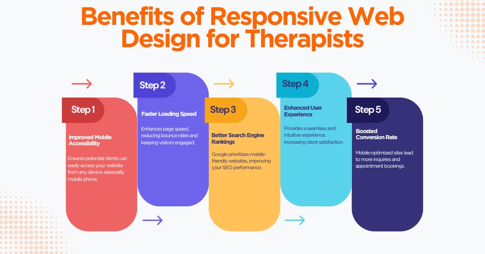
The Importance of Responsive Web Design for Therapists
Making It Easy for Clients to Access
People looking for therapy typically do so on their phones. They may be feeling vulnerable or anxious and want fast answers. If your site is not mobile-friendly, you may never help those people. A responsive design ensures accessibility regardless of time and device. Clients can learn about your services, verify credentials, and reach you effortlessly.
Building Trust Through Professionalism
A good website design for therapists represents professionalism. If you visited a therapist’s site that is difficult to navigate or poorly designed, would you feel confident in booking an appointment? A responsive website will make your practice look trustworthy, credible, and up-to-date! If your clients view a well-designed site, they may infer that you are focused and organized in the rest of your work.
Ranking Higher on Search Engines
When ranking search results, Google gives preference to responsive websites. If your website is mobile-friendly, it is more likely to show up higher on search engine pages. For therapists, this can be a game changer. Being easily found online may lead to more inquiries from new clients.
What is a Mobile-First Approach in Responsive Web Design?
A mobile-first approach means designing your website for mobile devices before expanding it to larger screens. This method focuses on the fact that most people now use their phones more than desktops.
Creating a site that works perfectly on a mobile device ensures great performance, faster loading times, and easier functions for users. The design can then scale up for tablets and desktops.
Advantages of a Mobile-First Approach
- Improved Speed: Mobile-first designs often load faster because they focus only on essential elements.
- Better Engagement: Clear and simple layouts lead to higher user interaction rates.
- Future-Proofing: As smartphone usage mounts and increases every day, you will already be ahead of the game by having a site that is very slick and user-friendly on phones and tablets.
Why Therapists Should Prioritize Mobile Users
Think about the times someone might look up therapy services. Many are browsing during a break at work, late at night, or while out and about. In these situations, they are likely on their phones. Making sure your website caters to these users can help you connect with people when they need help most.
Why Does Responsive Design Matter?
Responsive web design is not just a trend—it is a core part of keeping up with how people use the internet today.
Changing Digital Behavior and Trends
Smartphones and tablets are now the go-to devices for browsing. People expect that any website they use should roll out smoothly, whether it is a smartphone, a tablet or a big old computer screen. Failing to meet this expectation may push potential clients toward competitors with better-designed sites.
Cost and Time Efficiency Over Time
It is far more cost-effective to maintain one responsive website rather than juggling separate designs for mobile and desktop. A single responsive site works across all devices, which saves money and time in the long run.
Final Thoughts
For therapists, the importance of responsive web design cannot be overstated. Building a website that works on every device enhances accessibility, fosters trust, boosts online visibility and keeps you ahead in an increasingly mobile world. It sends a message to potential clients that you value their comfort and convenience, even before they step through your door.
Investing in a mobile-friendly and responsive website is not just smart—it is essential. Make sure your website reflects the same care and attention you offer in your practice. It might just be the first step to helping someone take control of their mental health.


